Icons
When enabled, DITA Bootstrap includes Bootstrap Icons by default. Additional icon libraries such as Font Awesome Feather and Octicons can also be added using command line parameters.
Bootstrap Icons
Bootstrap Icons is a growing
library of SVG icons that are designed by @mdo and maintained by the Bootstrap Team. They are open source and
licensed under MIT, just like Bootstrap so the icon set is freely available to everyone. A <Link> to the default Bootstrap Icons CDN set is included by default.
Example
Icon fonts with classes for every icon are included in Bootstrap Icons. Include the icon web fonts in your page
via CSS, then reference the class names as needed in your DITA (e.g., <i
outputclass="bi-alarm"/>).
Use an additional @otherprops and alter the CSS font-size and color to change the icon
appearance.
<i
          outputclass="bi-alarm"/>
<i outputclass="bi-alarm" otherprops="style(font-size: 2rem; color: cornflowerblue;)"/>Icons placed within an <xref> element are colorized appropriately:
<xref outputclass="link-primary" href="#">
  <i outputclass="bi-link"/> Primary link
</xref>
<xref outputclass="link-secondary" href="#">
  <i outputclass="bi-link"/> Secondary link
</xref>
<xref outputclass="link-success" href="#">
  <i outputclass="bi-link"/> Success link
</xref>
<xref outputclass="link-danger" href="#">
  <i outputclass="bi-link"/> Danger link
</xref>
<xref outputclass="link-warning" href="#">
  <i outputclass="bi-link"/> Warning link
</xref>
<xref outputclass="link-info" href="#">
  <i outputclass="bi-link"/> Info link
</xref>
<xref outputclass="link-light" href="#">
  <i outputclass="bi-link"/> Light link
</xref>
<xref outputclass="link-dark" href="#">
  <i outputclass="bi-link"/> Dark link
</xref>
<xref outputclass="link-body-emphasis" href="#">
  <i outputclass="bi-link"/> Emphasis link
</xref>
Icons can also be placed within buttons as shown:
<xref outputclass="btn-primary btn-floating m-1" href="#">
<i outputclass="bi-arrow-down-square-fill"/>
</xref>
<xref outputclass="btn-primary btn-floating m-1" href="#">
<i outputclass="bi-chat-left-quote-fill"/>
</xref>
<xref outputclass="btn-primary btn-floating m-1" href="#">
<i outputclass="bi-speedometer"/>
</xref>
<xref outputclass="btn-primary btn-floating m-1" href="#">
<i outputclass="bi-camera-fill"/>
</xref>
<xref outputclass="btn-primary btn-floating m-1" href="#">
<i outputclass="bi-link"/>
</xref>
<xref outputclass="btn-primary btn-floating m-1" href="#">
<i outputclass="bi-share-fill"/>
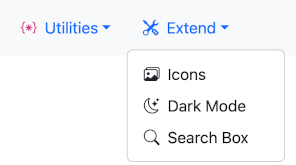
</xref>Icons can also be used within <chapter> headings,
and <topicref> elements by adding
<othermeta name="icon"> and
<othermeta name="icon-style"> elements.
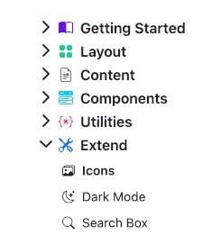
<chapter>
  <topicmeta>
    <navtitle>Extend</navtitle>
    <othermeta name="icon" content="bi-tools"/>
    <othermeta name="icon-style" content="color: var(--bs-blue)"/>
  </topicmeta>
  <topicref navtitle="Icons" format="dita" type="topic" href="icons.dita">
    <topicmeta>
      <othermeta name="icon" content="bi-images"/>
    </topicmeta>
  </topicref>
  ...
</chapter>
Installing other icons
Other icon sets such as Font Awesome Feather and Octicons are available. To use an alternative set of icons, modify the sample header or specify the path of the Icons CDN file using the --icons.cdn.path parameter.
dita --input=path/to/your.ditamap \
     --format=html5-bootstrap \
     --icons.include=yes \
     --icons.cdn.path=path/to/icon-cdn-header.xml
Excluding icons
For performance reasons, if you don't need any icons you can exclude them by setting the --icons.include=no
dita --input=path/to/your.ditamap \
     --format=html5-bootstrap \
     --icons.include=no