DITA Bootstrap
A plug-in for DITA Open Toolkit that extends the default HTML5 output with a Bootstrap 5.3 template and components.
Installing
Use the dita command to add this plug-in to your DITA Open Toolkit installation:
dita install fox.jason.extend.css
dita install net.infotexture.dita-bootstrap
dita --install fox.jason.extend.css
dita --install net.infotexture.dita-bootstrapdita --install https://github.com/jason-fox/fox.jason.extend.css/archive/master.zip
dita --install https://github.com/infotexture/dita-bootstrap/archive/master.zipUsing
Specify the html5-bootstrap format when building output with the dita command:
dita --input=path/to/your.ditamap --format=html5-bootstrapBootswatch themes
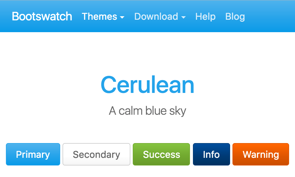
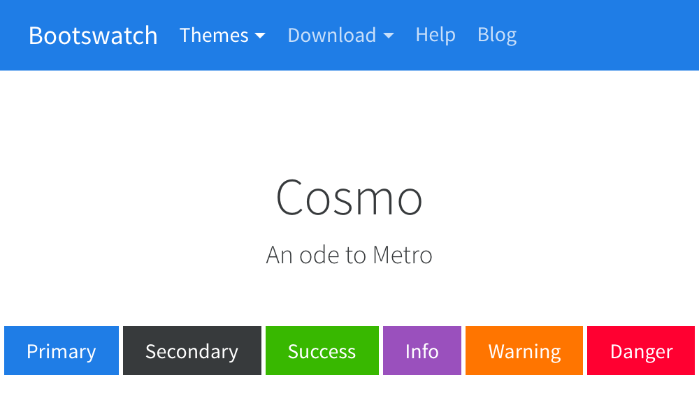
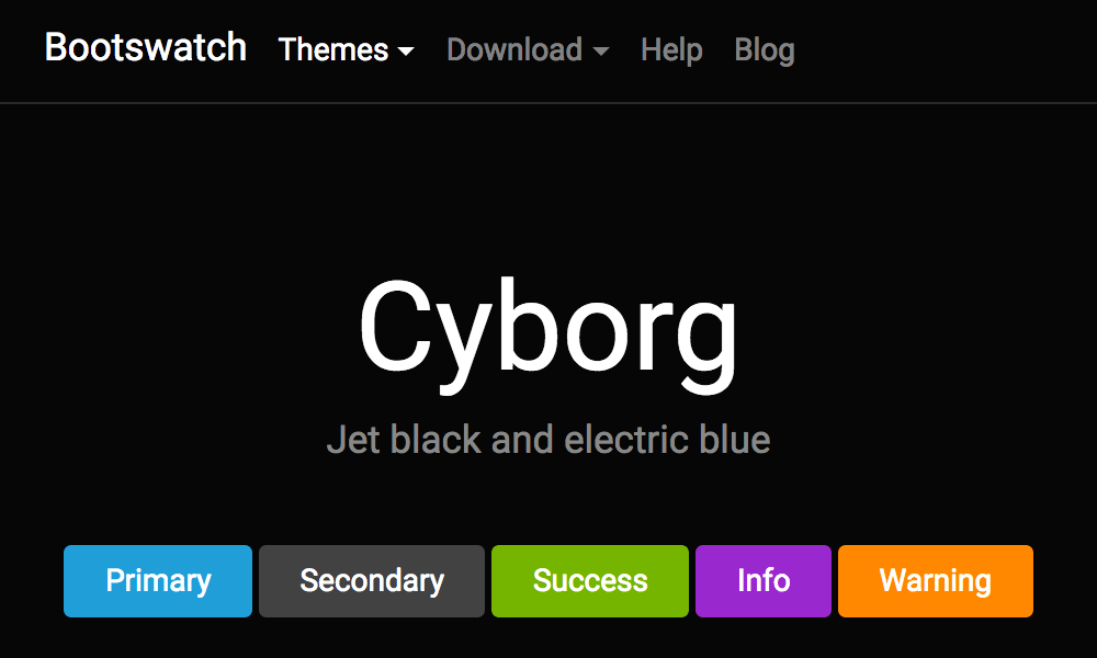
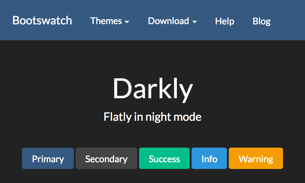
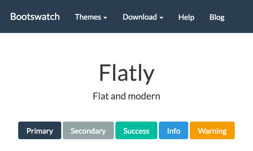
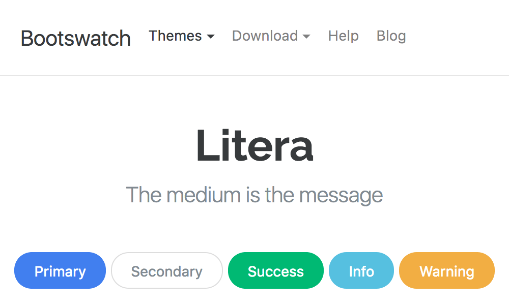
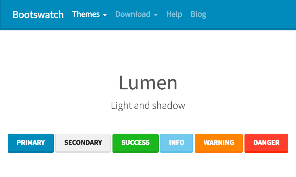
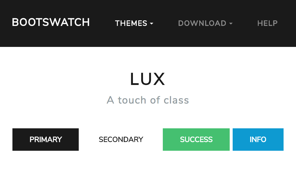
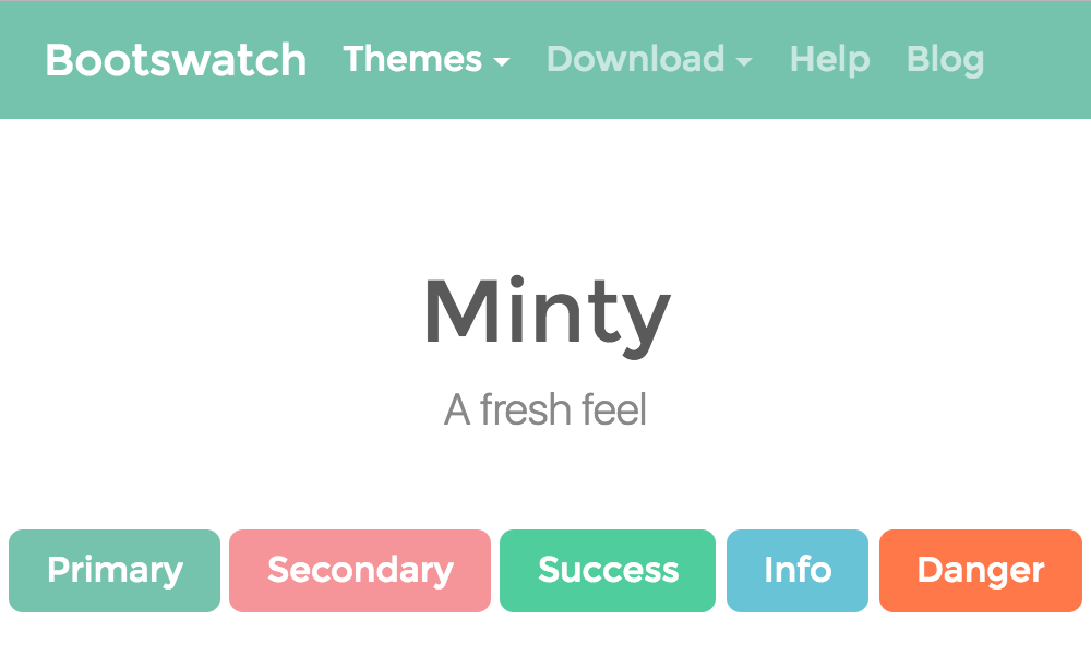
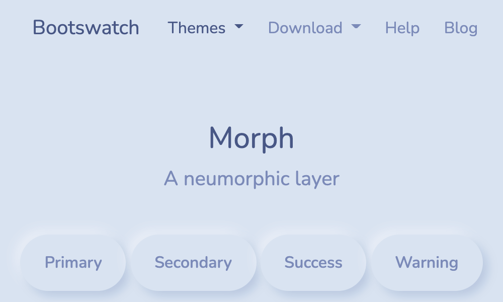
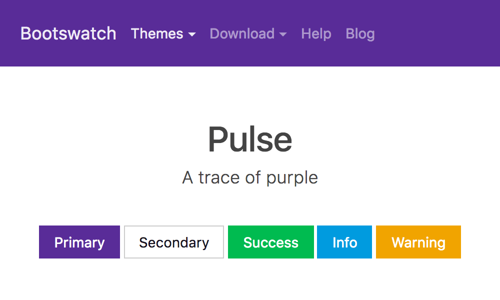
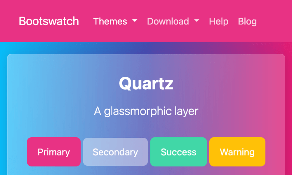
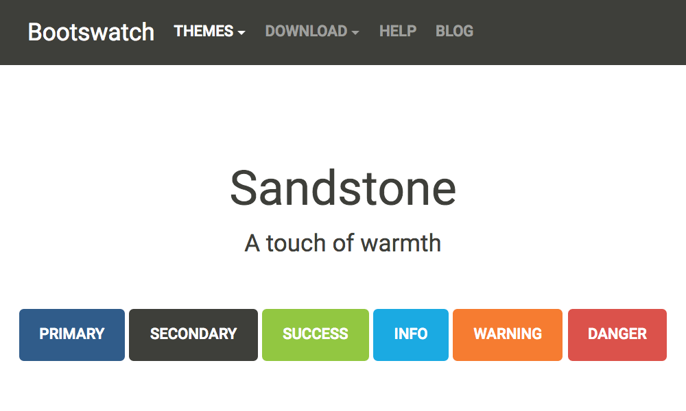
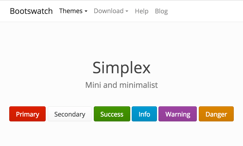
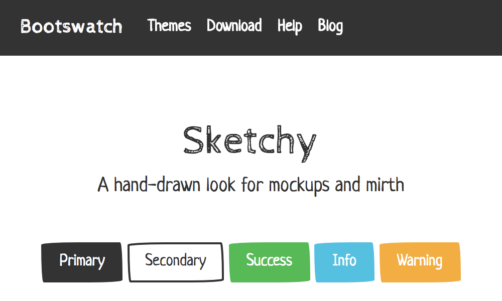
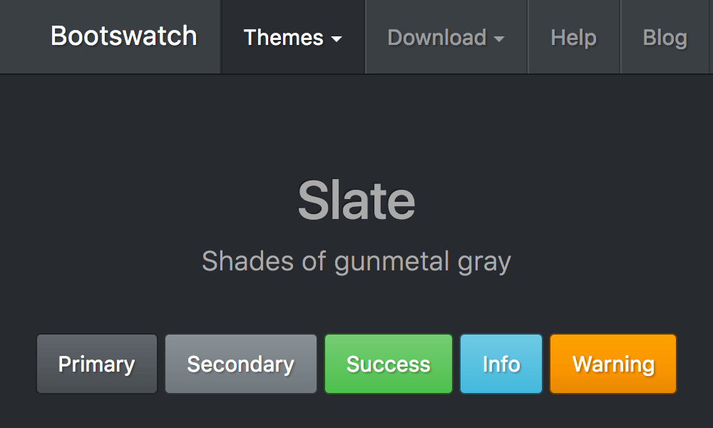
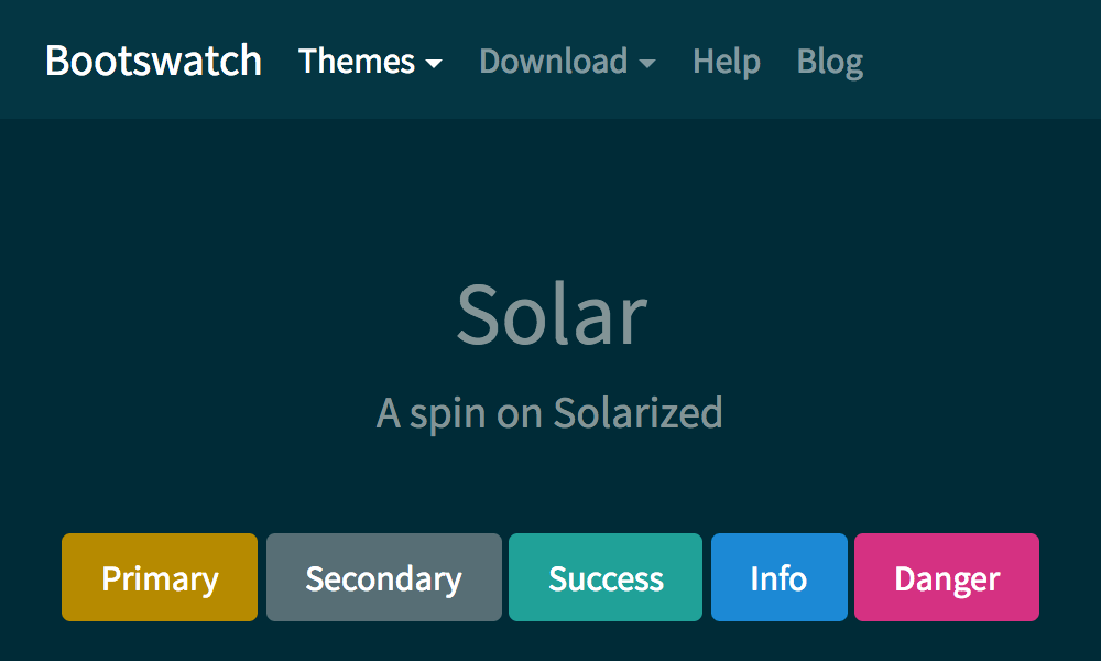
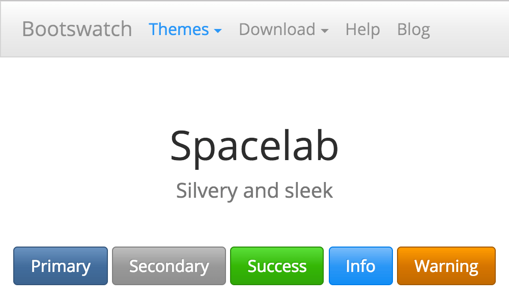
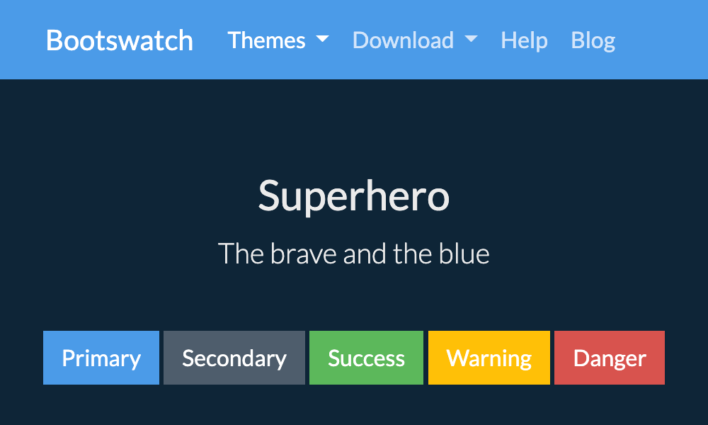
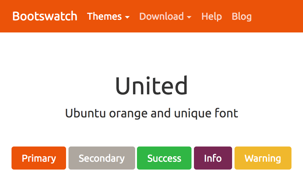
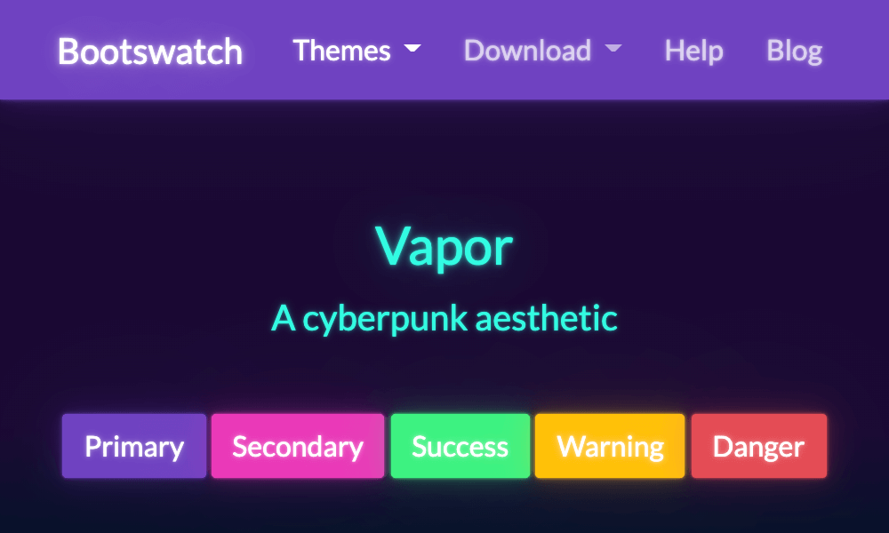
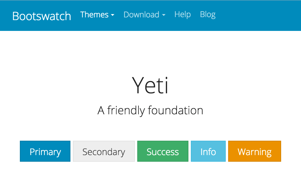
Alternate Bootstrap themes can be downloaded directly from Bootswatch. To override the default appearance with a Bootswatch theme, pass a theme name to the dita command via the --bootstrap.theme parameter:
dita --input=path/to/your.ditamap \
     --format=html5-bootstrap \
     --args.hdr=path/to/your-header.xml \
     --bootstrap.theme=<theme-name>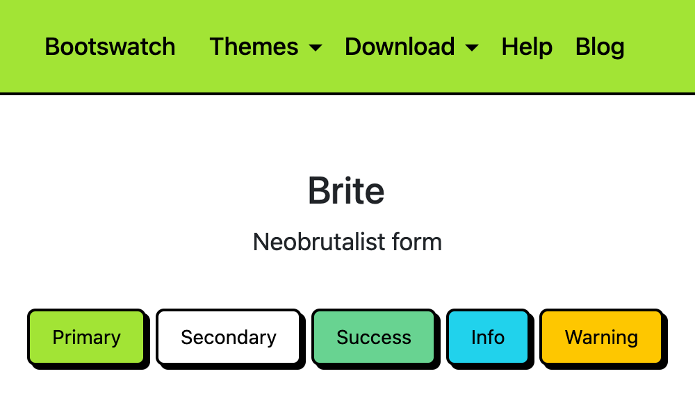


Custom CSS
To extend the chosen theme, pass a custom CSS file to the dita command via the --args.css parameter. For a complete override of the theme where the default Bootstrap CSS is no longer required, you can disable it by setting --bootstrap.theme=none:
dita --input=path/to/your.ditamap \
     --format=html5-bootstrap \
     --bootstrap.theme=none \
     --args.hdr=path/to/your-header.xml \
     --args.css=<name-of-css>.css \
     --args.copycss=yes \
     --args.csspath=css \
--args.cssroot=path/to/your/themeCustomizing headers, footers and sidebars
The plug-in includes a default static navigation menu with a project name and global link placeholders.
The default header file includes/hdr.navbar.default.xml uses the Bootstrap primary (blue) background color for the navbar component, and provides a theme menu to toggle dark mode. Bootstrap itself offers additional header examples.
You can edit a copy of this file to adjust the content of the global navigation. To override the global navigation with your own header, pass a custom header file to the dita command via the --args.hdr parameter:
dita --input=path/to/your.ditamap \
     --format=html5-bootstrap \
     --args.hdr=path/to/your-header.xml
The plug-in includes a sample header alternative with a light navbar.
No footer is added by default, but the plug-in also includes a sample footer file and Bootstrap also offers additional examples. To add a footer to the generated output, pass a custom footer file to the dita command via the --args.ftr parameter:
dita --input=path/to/your.ditamap \
     --format=html5-bootstrap \
     --args.ftr=path/to/your-footer.xml
The plug-in extends the standard HTML5 table of contents (ToC) navigation parameter --nav-toc to add a styled navigation sidebar to the output.
As of version 5.3.1, the plug-in provides five new --nav-toc options to style the table of contents navigation with either the Bootstrap list group component, nav-pills, or collapsible menus. The following new options are available:
- nav-pill-full
- Styled full ToC using nav-pills
- nav-pill-partial
- Styled partial ToC using nav-pills
- list-group-full
- Styled full ToC within a list group
- list-group-partial
- Styled partial ToC within a list group
- collapsible
- Styled full ToC with collapsible elements
dita --input=path/to/your.ditamap \
     --format=html5-bootstrap \
--nav-toc=<sidebar-style>Common Bootstrap utility classes
The HTML output for the following DITA elements can be annotated with common Bootstrap utility classes for borders, background, text, spacing, etc. using additional command line parameters:
- --bootstrap.css.accessibility.link
- Common Bootstrap utility classes for accessibility links
- --bootstrap.css.accessibility.nav
- Common Bootstrap utility classes for accessibility navigation
- --bootstrap.css.accordion
- Common utility classes for Bootstrap accordion components
- --bootstrap.css.card
- Common utility classes for Bootstrap card components
- --bootstrap.css.carousel
- Common utility classes for Bootstrap carousel components
- --bootstrap.css.carousel.caption
- Common utility classes for Bootstrap carousel captions
- --bootstrap.css.carousel.indicators
- Common utility classes for Bootstrap carousel indicators
- --bootstrap.css.codeblock
-
Common Bootstrap utility classes for DITA
<codeblock>elements - --bootstrap.css.container.size
- Bootstrap container class for main layout and menubar-TOC
- --bootstrap.css.dd
- Common Bootstrap utility classes for DITA
<dd>definition description elements - --bootstrap.css.dl
- Common Bootstrap utility classes for DITA
<dl>definition list elements - --bootstrap.css.dt
- Common Bootstrap utility classes for DITA
<dt>definition term elements - --bootstrap.css.figure
- Common Bootstrap utility classes for DITA
<fig>elements - --bootstrap.css.figure.caption
-
Common Bootstrap utility classes for DITA
<title>elements within<fig>elements - --bootstrap.css.figure.image
-
Common Bootstrap utility classes for DITA
<image>elements within<fig>elements - --bootstrap.css.footer
-
Common utility classes for the HTML
<footer>element - --bootstrap.css.nav.parent
- Common Bootstrap utility classes for ancestors of active nav-pill elements
- --bootstrap.css.pagination
- Common utility classes for Bootstrap pagination components
- --bootstrap.css.section.title
-
Common Bootstrap utility classes for DITA
<title>elements within<section>elements - --bootstrap.css.shortdesc
-
Common Bootstrap utility classes for DITA
<shortdesc>elements - --bootstrap.css.table
-
Common Bootstrap utility classes for DITA
<table>elements - --bootstrap.css.tabs
- Common utility classes for Bootstrap tabbed dialog components
- --bootstrap.css.tabs.vertical
- Common utility classes for Bootstrap vertical tabbed dialog components
- --bootstrap.css.thead
- Common Bootstrap utility classes for DITA
<thead>elements - --bootstrap.css.topic.title
-
Common Bootstrap utility classes for DITA
<title>elements within<topic>elements
Bootstrap icons for DITA notes
The default Bootstrap icons used for DITA <note> elements can be overridden using additional command line parameters:
- --bootstrap.icon.note
- Icon for standard notes
- --bootstrap.icon.attention
- Icon for attention notes
- --bootstrap.icon.caution
- Icon for caution notes
- --bootstrap.icon.danger
- Icon for danger notes
- --bootstrap.icon.fastpath
- Icon for fastpath notes
- --bootstrap.icon.important
- Icon for important notes
- --bootstrap.icon.notice
- Icon for notice notes
- --bootstrap.icon.remember
- Icon for remember notes
- --bootstrap.icon.restriction
- Icon for restriction notes
- --bootstrap.icon.tip
- Icon for tips
- --bootstrap.icon.trouble
- Icon for trouble notes
- --bootstrap.icon.warning
- Icon for warning notes
Optional elements
Bootstrap icons, popovers, tooltips and the dark mode toggler are enabled by default, but for performance reasons they can be disabled by setting the following command line parameters to no:
- --icons.include
- Enable Bootstrap icons
- --popovers.include
- Enable Bootstrap popover components and tooltip components
- --dark.mode.include
- Whether to include support for a dark mode toggler
Opt-in breadcrumbs and menu bars and other modifiers can be enabled by setting the following command line parameters to yes:
- --args.breadcrumbs
- Enable Bootstrap breadcrumb components
- --menubar-toc.include
- Add a Bootstrap menubar
- --bidi.include
- Whether to force included support for RTL languages
The following additional command line parameters are also available and described in more detail within the documentation:
- --scrollspy-toc
- Add a Bootstrap scrollspy navigator
- --toc-spacer.padding
- Vertical padding to add to the side menu
@outputclass attribute. This text is therefore a derivative
of Bootstrap 5 docs by Twitter, Inc. and the Bootstrap Authors, and used under
CC BY 3.0.