Navigation Menus
Add a responsive Bootstrap-styled table of contents to your HTML output.
Sidebar
The plug-in extends the standard HTML5 table of contents (ToC) navigation parameter --nav-toc to add table of contents items to the navigation sidebar. (The navigation is rendered as a sidebar in desktop browsers and collapsible on smaller devices.)
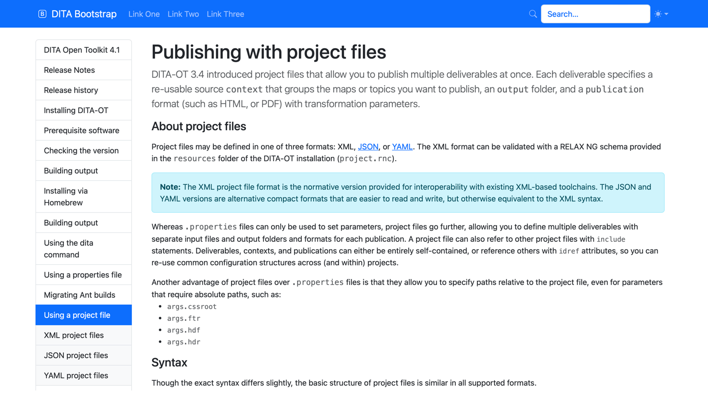
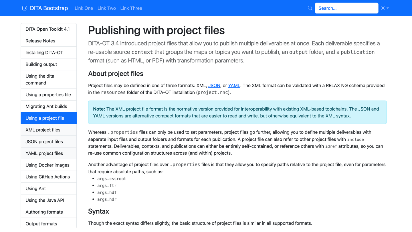
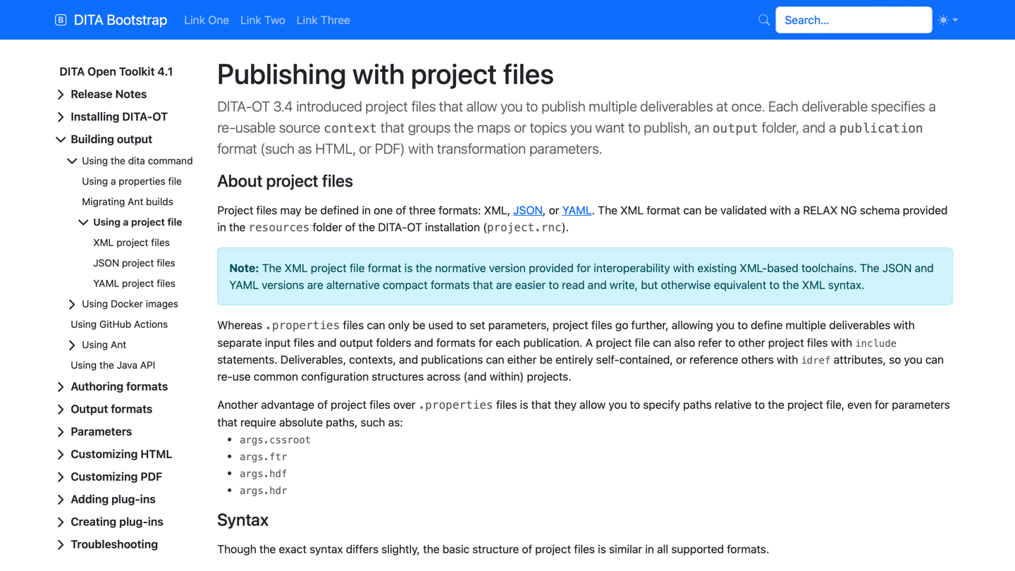
By default, the plug-in uses the partial option to include the current topic in the ToC along with its parents, siblings and children. As with the default HTML5 plug-in, the full option can also be used to generate a complete ToC for the entire map, or none to disable the table of contents entirely.
As of version 5.3.1, the plug-in provides five new options to style the table of contents navigation with either the Bootstrap list group component, nav-pills, or collapsible menus.
- list-group-full – Styled full ToC within a Bootstrap list group
- list-group-partial – Partial ToC with the current topic, parents, siblings, and children in a list group
- nav-pill-full – Styled full ToC using Bootstrap nav-pills
- nav-pill-partial – Partial ToC with the current topic, parents, siblings, and children using Bootstrap nav-pills
- collapsible – Styled full ToC using collapsible list elements
To use these options, pass the desired value to the dita command via the --nav-toc parameter:
dita --input=path/to/your.ditamap \
     --format=html5-bootstrap \
     --nav-toc=<sidebar-style>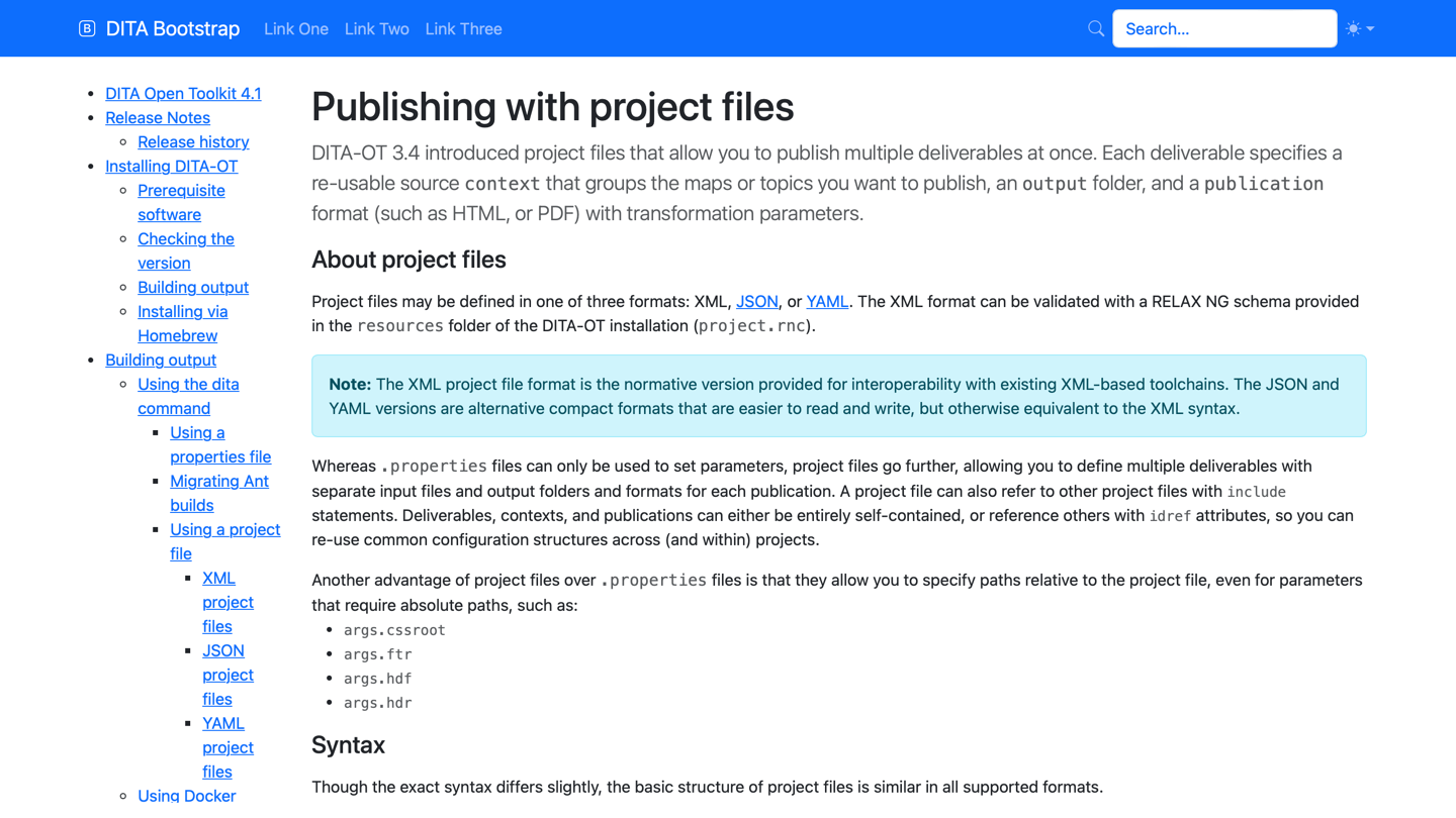
full – DITA-OT default unstyled full ToC

partial – DITA-OT default unstyled partial ToC

nav-pill-full – Styled full ToC using nav-pills

nav-pill-partial – Styled partial ToC using nav-pills
list-group-full – Styled full ToC within a list group
list-group-partial – Styled partial ToC within a list group
collapsible – Styled full ToC with collapsible elements
The sidebar is hidden by default on mobile. To ensure that the sidebar content can be accessed, the header file must include the following toggle with @data-bs-target="#bdSidebar"
and @data-bs-toggle="offcanvas":
<div class="bd-navbar-toggle">
  <button class="navbar-toggler p-2" type="button"
    data-bs-toggle="offcanvas" data-bs-target="#bdSidebar"
    aria-controls="bdSidebar" aria-label="Toggle docs navigation">
    <i class="bi bi-list"/>
  </button>
</div>
The look and feel of the mobile sidebar header can be altered using the --bootstrap.sidebar.hdr parameter and supplying an HTML header file:
dita --input=path/to/your.ditamap \
  --format=html5-bootstrap \
  --nav-toc=<sidebar-style> \
  --bootstrap.sidebar.hdr=path/to/your.header
The plug-in includes a sample header.
No footer is added to the sidebar by default, but a custom sidebar footer can be added using the --bootstrap.sidebar.ftr parameter and supplying an HTML footer file:
dita --input=path/to/your.ditamap \
  --format=html5-bootstrap \
  --nav-toc=<sidebar-style> \
  --bootstrap.sidebar.footer=path/to/your.footer
The plug-in also includes a sample custom footer.
Menu bar
Additionally, the first-level navigation menu can be switched to a horizontal Bootstrap navbar to reduce the depth of the ToC. To use this option, add the --menubar-toc.include=yes parameter to the dita command:
dita --input=path/to/your.ditamap \
     --format=html5-bootstrap \
     --nav-toc=list-group-partial \
     --menubar-toc.include=yes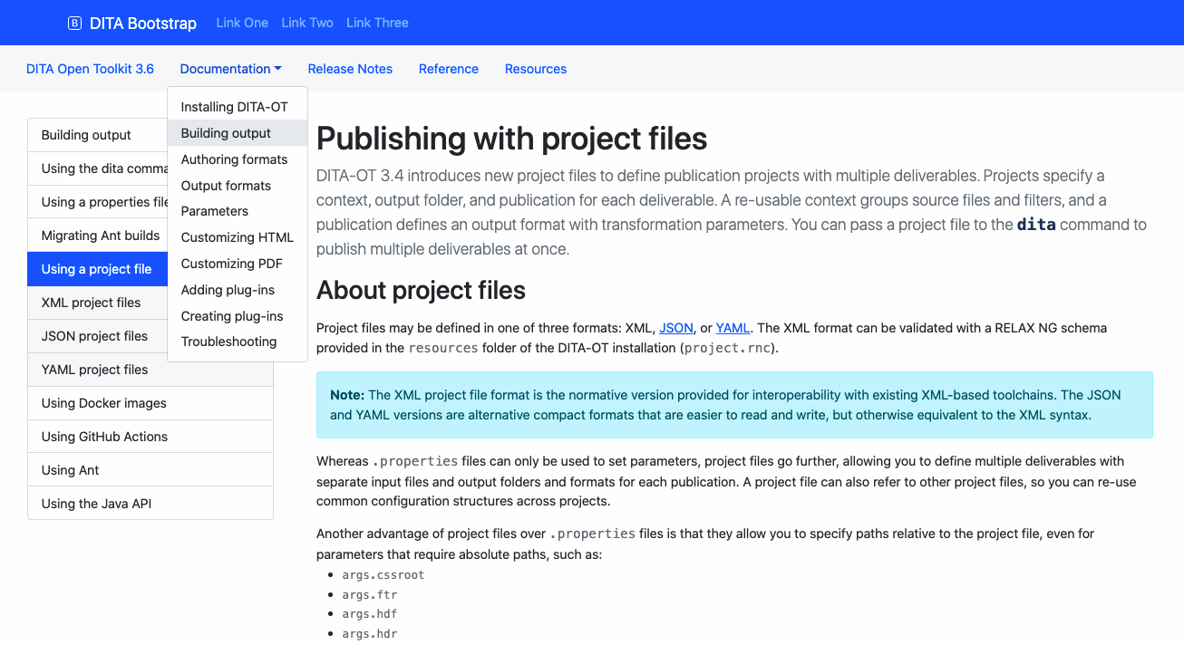
Top bar
A collapsible menu placed above the main menu can be included by adding the --bootstrap.topbar.hdr parameter to the dita command:
dita --input=path/to/your.ditamap \
     --format=html5-bootstrap \
     --nav-toc=<sidebar-style> \
     --bootstrap.topbar.hdr=path/to/your.header
The plug-in also includes a sample custom header.
Dividers
Dividers can be added to items rendered in collapsible sidebars and menus by adding the
<othermeta name="divider"> element to the <topicmeta> element in the DITA map topic reference. You can specify a label for the divider via the
@content attribute on the <othermeta> element.
<topicref navtitle="Search Box" format="dita" type="topic" href="search-box.dita">
  <topicmeta>
    <othermeta name="divider" content="Additional Plug-ins"/>
  </topicmeta>
</topicref>